Vermilion Red – Zinnoberrot
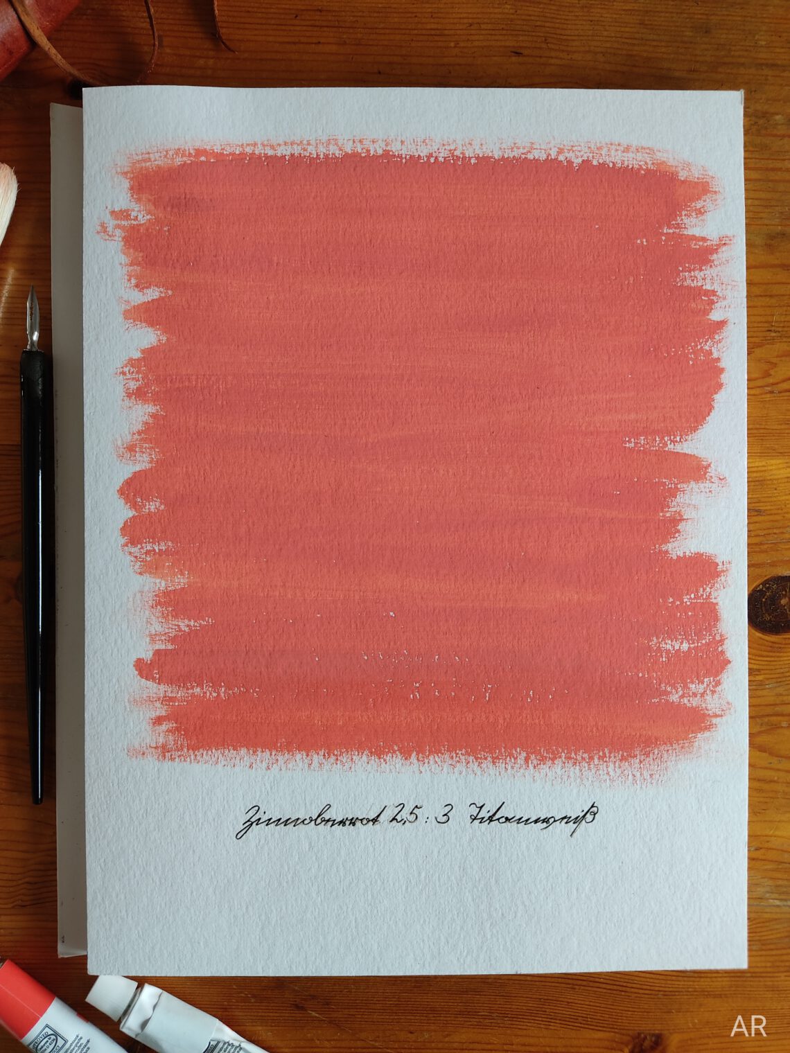
Vermilion red. To be honest I thought there were more beautiful reds out there. It appeared kind of shallow to me, lacking vibrancy and being a bit too orange. Yes, I know, it depends on what you are going to do with the colour but I can’t help it. It was a little disappointing. It all changed when white entered the game! The orange seemed to vanish, the colour softened and a beautiful coral-like tone appeared. Wow! I felt like walking in a coral forest.
Sometimes I like a colour so much that I just want to fill big spaces with it. With a big brush and big movements. Just for the joy of doing something with it and watching at it. This is exactly what happened here. No more disappointment at all! You can still spot the brush strokes (bristle brushes!) and also the colour is not mixed perfectly. Some parts are brighter containing more white and at some parts the vermilion red is more prominent. The texture and depth which comes with that is something I really like. It brings the piece to life and adds character. So it doesn‘t get boring even if it is basically just a colour field. Isn’t it fascinating how tiny things like adding a bit of white can change things completely!
Research
Even though the colour itself was not too exciting at first its name definitely is! „Vermilion red“. In German it’s „Zinnoberrot“. Both sound kind of unfamiliar, maybe even a little awkward. „Zinnober“ definitely has something old-fashioned to it, I don’t know if it is the same with „vermilion“ (let me know!)? But they also provide an adventurous feeling! Don’t ask me why – everytime I hear or even more when I say those names out loud I get the feeling of an historical vintage adventure, maybe like a treasure hunt. I honestly have no clue where this might come from but it’s fun!
Back to research!
So where do those names come from? Unfortunately I could not solve this case completely. „Zinnober“ goes back to the mineral cinnabar which was used to create pigment for painting from ancient times until the 19th or 20th century.
So this is the secret to „Zinnober“. But what about „vermilion“? If you have any ideas please let me know (hello@annikaruhwedel.com)! I would be more than happy to fill this knowledge gap!
What else?
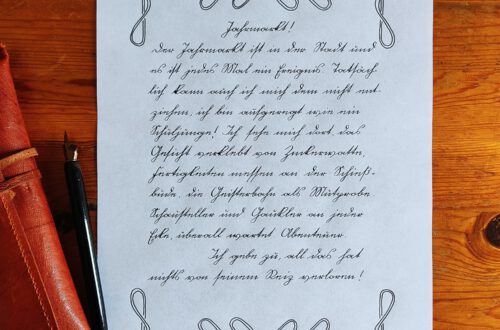
Back to the painted picture! The text below the colour is written in german cursive (aka Kurrent) and says „Zinnoberrot (Vermilion red) 2,5“ and „Titanweiß (Titanium white) 3“ meaning the coral colour is made of 2,5 parts Vermilion red and 3 parts of Titanium white.
Have a great day!
Annika


Das könnte dich ebenfalls interessieren
Zg, Zr and Kr – „The Modern One“
Impressionen der Vernissage am 19.02.2026 in der Brot-Galerie