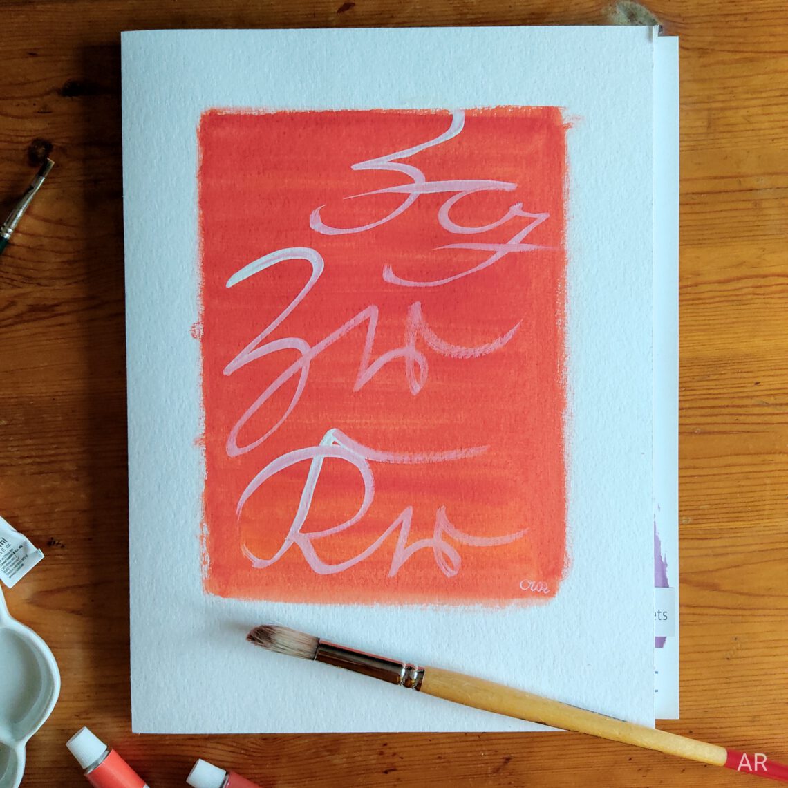
Zg, Zr and Kr – „The Modern One“
“Zg, Zr, Kr” – what a name for a painting! Well, its the abbreviations for the colours used. It is written in Kurrent (aka German cursive) and reads:
Zg = Zitronengelb = Lemon
Zr = Zinnoberrot = Vermilion Red
Kr = Karminrot = Carmine Red
So again Vermilion Red! Eventhough this colour is not my favourite one (I think it is a bit boring to be honest) there obviously is something about it as I tend to use it again and again (see also the blogpost on Vermilion Red). Maybe because it is so nice to use in mixtures?
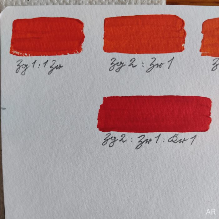
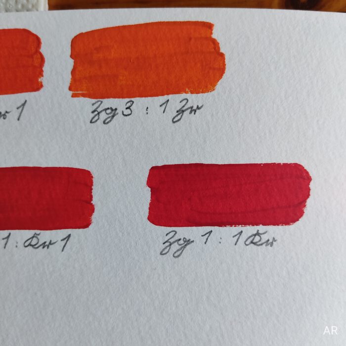
For this painting I originally had an orange-yellow in mind leaning towards a straw-like colour. And I wanted to use Vermilion Red. Why? I don’t even know. It seemed clear that Vermilion Red was not really the colour to get a straw-like tone. Anyway I tried and yes, if you use a lot of Lemon you’ll get to orange-yellow. But no straw. While mixing the colours I thought a bit of Carmine Red would give that orange an interesting twist. So I decided to keep the idea of straw for the future and give Carmine Red a go.
Before creating this painting I tested the colours and mixtures in my sketchbook, find a picture in the gallery below. In the end there were like three different mixtures of Lemon, Vermilion Red and Carmine Red which all were beautiful but I didn’t really know what to do with. I didn’t have a final picture in mind so I just took all those different colour mixtures and layered them on drawing paper. It ended up in a beautiful colour gradient of rich and bold reds and oranges! Tasty!
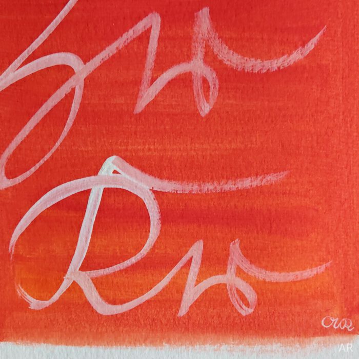
Then again I was wondering how to integrate Kurrent script into the piece. Because, this is what this website, my work, is all about: Celebrating Kurrent script. Adding a sense of historic adventure to everyday life with that sript. In recent pieces I simply wrote the colours’ name below the coloured square. But this didn’t feel right here as I already did such a piece containing Vermilion Red (see here). It shouldn’t feel like a kind of unsubstantial copy of it. I wanted to incorporate the single colours’ names but how? It should feel freer than the first Vermilion Red piece which has a very clean and straight energy I think. The picture of the colour abbreviations written inside the colour square came up. Written with a brush and not being too strict with perfectly meeting the script’s angle or staying exactly inside the colour square. Let’s go over the lines! I got a bit excited about this approach 🙂
So this is what you see here. Written with a brush I love how the white is very thick in the beginning of the letters and getting thinner while writing letting more of the orange-red shining through. Also I was standing while writing allowing bigger movements with my hand than usual. It was so much fun (see also the video below)!
Usually I appreciate the authentic 19th-century vibe I get when writing with a dip pen. This piece feels a bit more modern but the script itself is enough to add the historic touch I’m always aiming for.
Writing that way, with a brush, big and free movements, going over the lines felt so joyful and I’m very happy to have made that experience 🙂
If you are curious check out the fine art print of Zg Zr Kr in the shop!
Wishing you a great day!
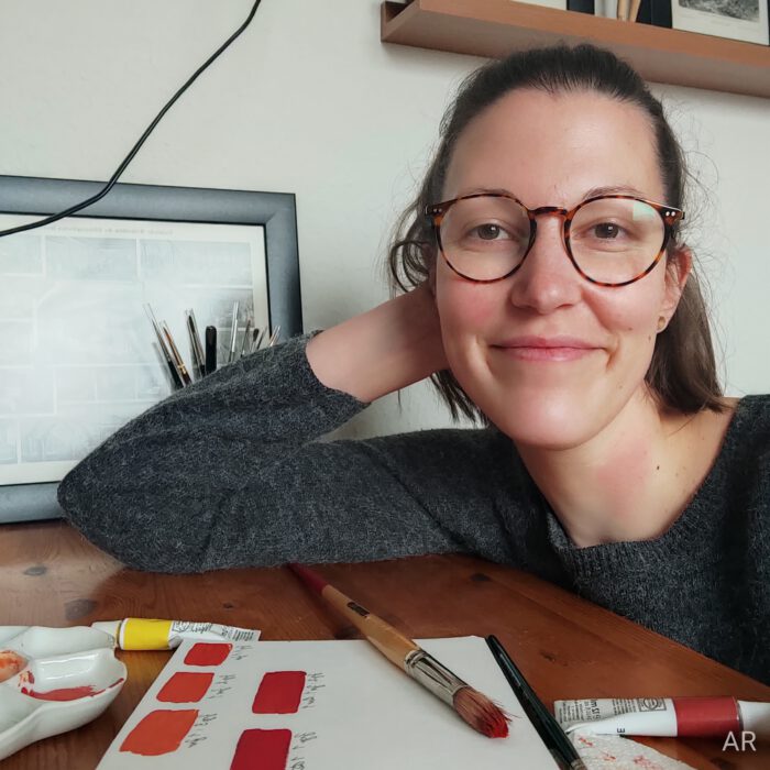
Annika


Das könnte dich ebenfalls interessieren
Pt. 4) Meine erste Ausstellung – hinter den Kulissen: Bilder hängen
Shop opening!