Violet – Violett
Such a beautiful colour! Again and again I am totally amazed by how divers this colour is and in how many shapes it shows up. Yes, this might be (and probably is) true for every colour. But there ist something about violet that gets me every time. It has something mystical to it, fascinating. I always see violet as a swirling cloud of fog keeping something precious and mysterious (the same, anyone ..? :-D).
Recently I have a special shade of violet in mind as part of a certain colour palette. And because I found the colour testing pages for the water lily piece in my sketchbook so beautiful I decided to make the search for that special shade of violet a piece in itself!
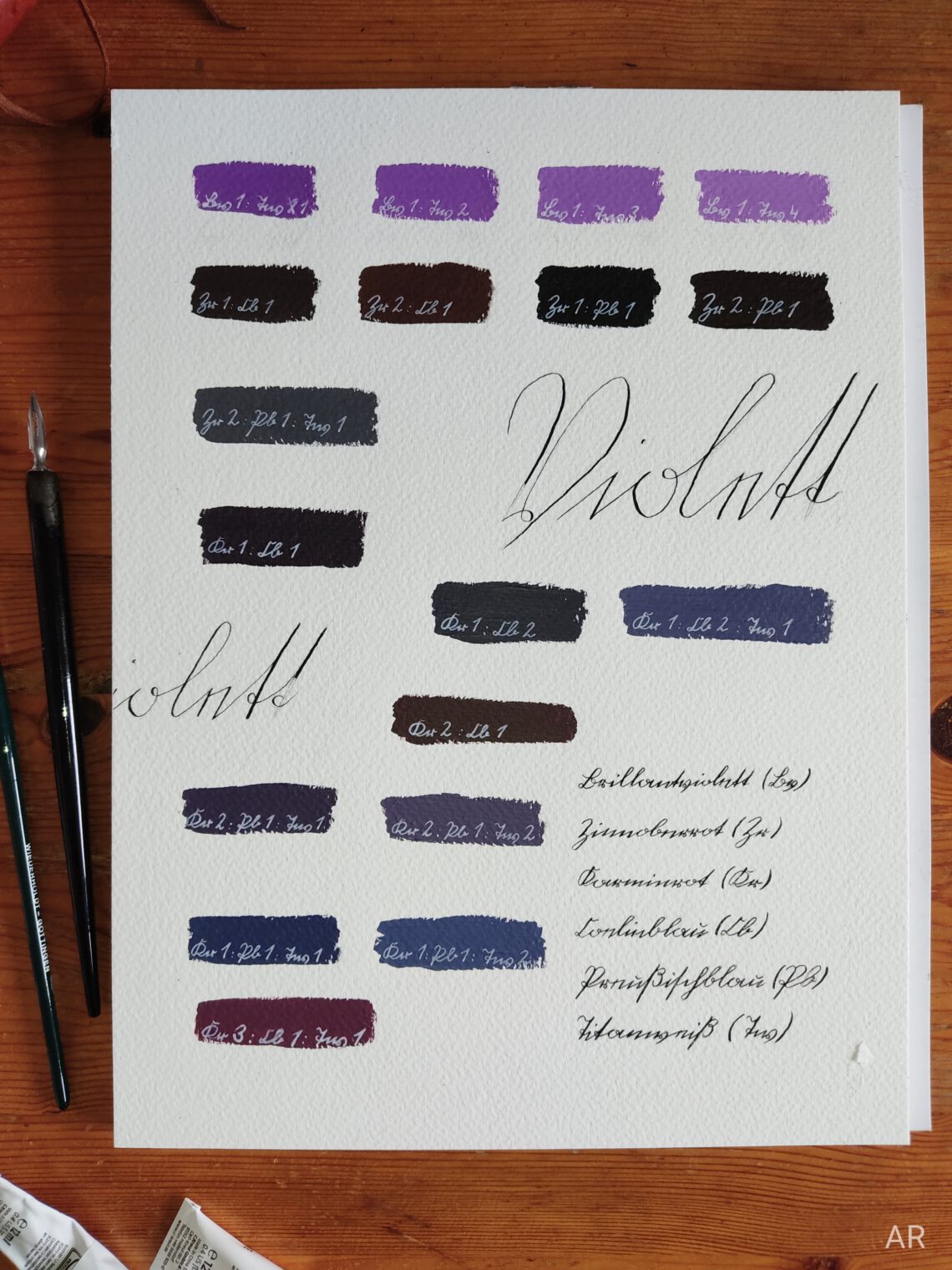
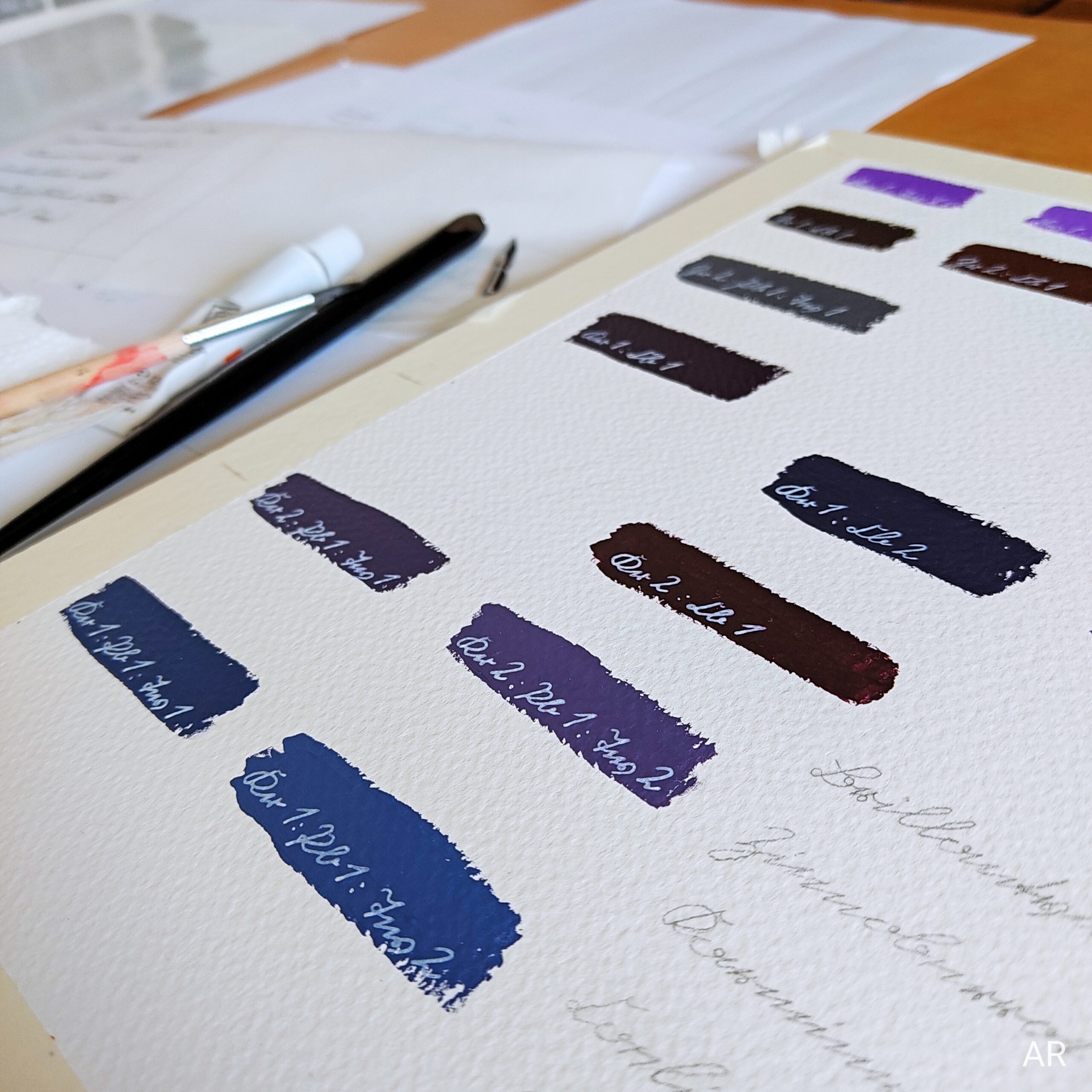
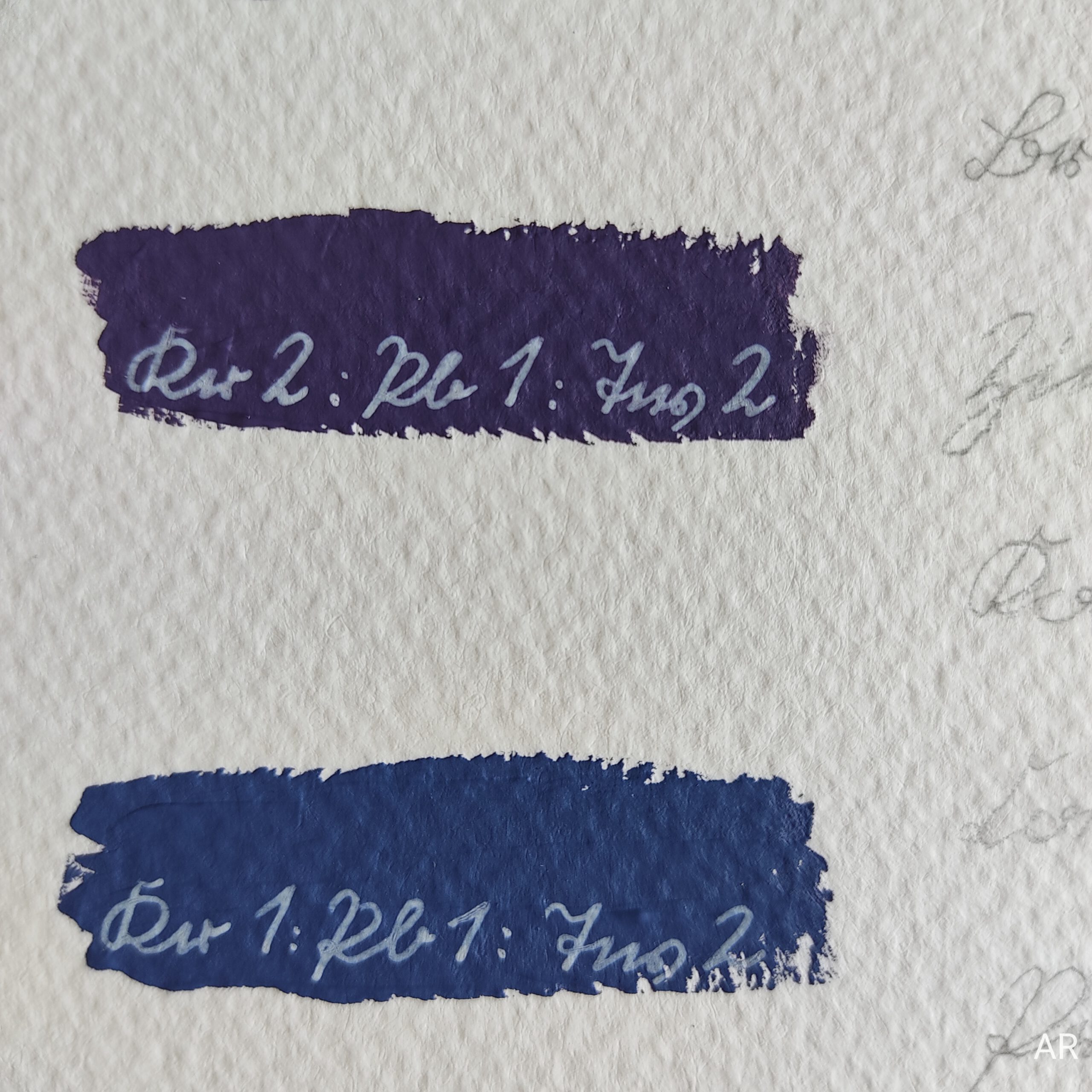
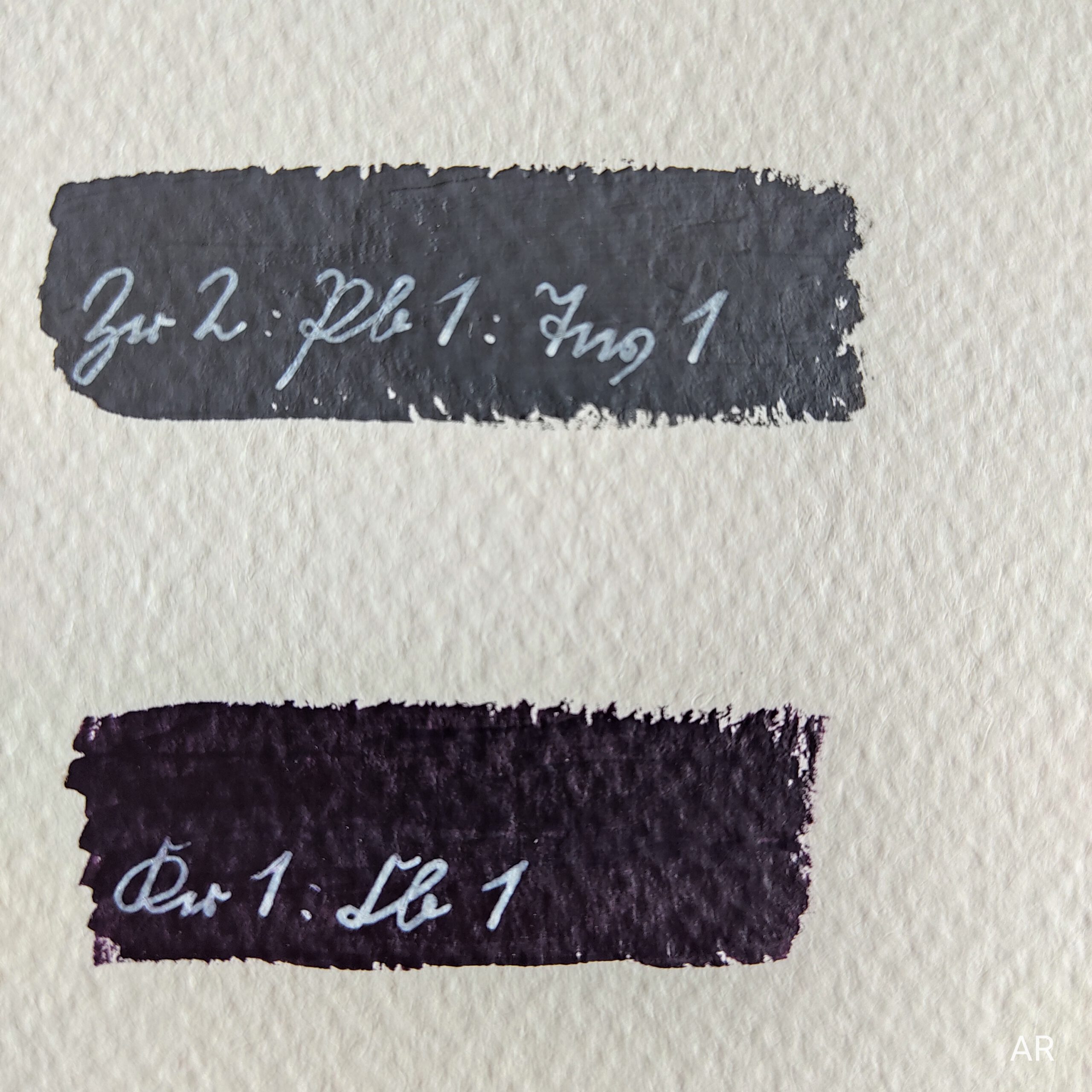
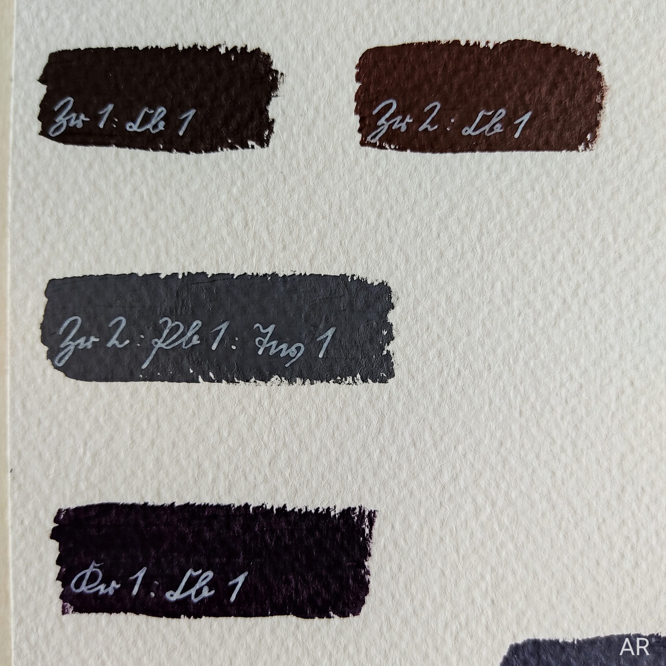
So I just started with the colours I have to see where it may lead. First of all the ready-mixed violet you see in the very upper line of the picture. Well, turned out it is not at all what I was looking for. So I went on with mixing the two reds and blues I have with or without white in every imaginable combination (see the abbreviations in each colour test!).
And yeah, you´re right, the upper part of the piece barely looks like violet, doesn´t it? I was totally surprised! But since it is a piece about colour testing and the search for a specific tone I decided to keep those trials. Such an exciting process, with every trial I got closer. The violet I was originally looking for is somewhat like the tones in the second row from the bottom (drifting towards the blue side of the violet spectrum).
Documenting this search and preserving it for you was so much fun and highly interesting! In the end it is a piece I enjoy very much – looking at all those variations of violet (and there are so many more!) and the associations they bring. I hope you enjoy this piece as well!
Research
While researching I found out there is a difference between „violet“ and „purple“ / „lilac“ which I have to admit still is a little confusing to me. While violet is one of the prismatic colours defined by a specific wavelength purple and magenta / pinkish shades do not appear in the physical light spectrum (like e. g. pink is no part of the rainbow! I never noticed!). You simply create them by mixing blue and red, emphasising the red part.
While this is truly fascinating I won´t dive deeper into this physical topic for now as I don´t feel experienced enough to provide you with profound information here. But it surely is worth researching!
As already mentioned violet – or probably purple to be more precise, I guess – is a mixture of red and blue. Those two colours have gone through a major shift regarding their social perception (at least that´s what I can tell from living in Germany).
Red was and still is known for symbolising power and strength – think of a king´s or the pope´s coat. In the past it was also associated with war, battle and blood thus masculinity. So until the first half of the 20th century the chosen colour for boys was pink – the „little red“.
The feminine was symbolised by blue, the colour of Virgin Mary. That is why a light blue, the „little blue“ was the colour for girls.
Isn´t that fascinating? This is one of those situations where I realise how powerful social conventions are. I like to think of myself as not being too stuck in those conventions but I have to admit that it is quite hard for me to associate pink with being a typical boys´ colour as it is just the total opposite today! So I´m very happy coming across information like this as it helps me loosening up my own perspectives.
With this in mind it is interesting that in the 19th century the colour of the feminist movement was purple. It was meant to symbolise gender equality as it is located between red and blue i. e. between the masculine and feminine.
It´s so exciting how many different aspects there are to colour. Physical, emotional, biological, social and political facets – there is always more to discover (and I can´t wait)!
Have a great day
Annika


Das könnte dich ebenfalls interessieren

Vernissage!
Ausstellung!