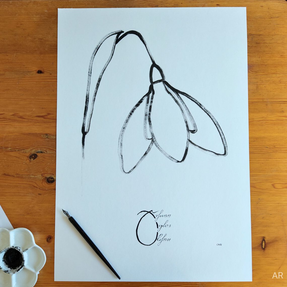
Snowdrop – Schneeglöckchen
By the time I write this blog post it is already April. No more snowdrops to be seen outside but we are still in the beautiful time of spring bloomers. The pops of colour after winter, their delicate appearance – I deeply love plants and spring bloomers are probably the ones I love the most.
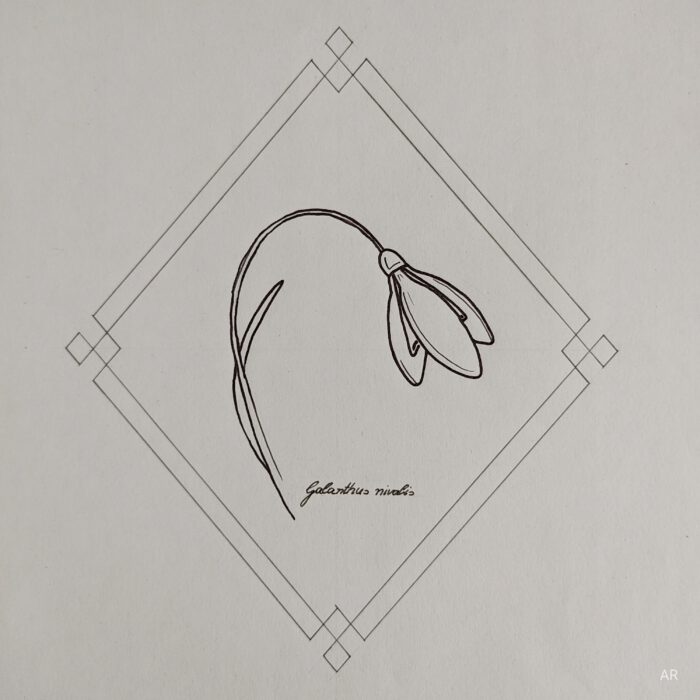
So when spring arrives I just cannot resist and have to draw some spring bloomers. So far this spring is quite cold here in Göttingen. So when I decided to create a spring bloomers fine art print about four weeks ago a snowdrop did not seem inappropriate – it even was snowing!
In the process of creating a “Snowdrop” design two years ago I practised drawing it a lot and since then the lines have been engraved in my brain.
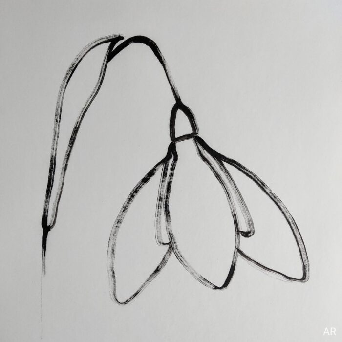
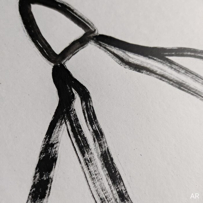
For the current piece the idea what the flower should look like was pretty clear: Somewhat rough maybe like a linocut with thick lines and visible strokes of the bristle brush. What a nice contrast to the snowdrop’s natural dainty shape! I like that way of painting. Thanks to the practice two years ago the flower was done easy-going.
But I didn’t expect what happened next! I had no idea how to incorporate the Kurrent sript lettering “Snowdrop” into the piece. So I sketched and sketched and tested many different approaches. And actually most of them looked nice but they did not match the rough character of the flower looking too playful and sweet. All I knew was that the final picture should look minimalistic and have this rough character. So I focused on that, tried out some more letterings and in the end the matching idea popped up.
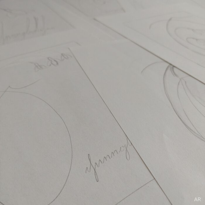
Interestingly the fact that it took a while to find the right design did not annoy me at all. Instead I was curious of what the next trial would look like. That was totally new! Usually I get nervous and stressed when finding the right design takes longer or if I don’t have the final layout of the piece in mind. But I was certain the right idea would come eventually and it was just a question of time and trial and error. Feeling that certainty was so calming. It took off a lot of pressure and gave space to play around with ideas. Maybe creativity can really be trained 🙂
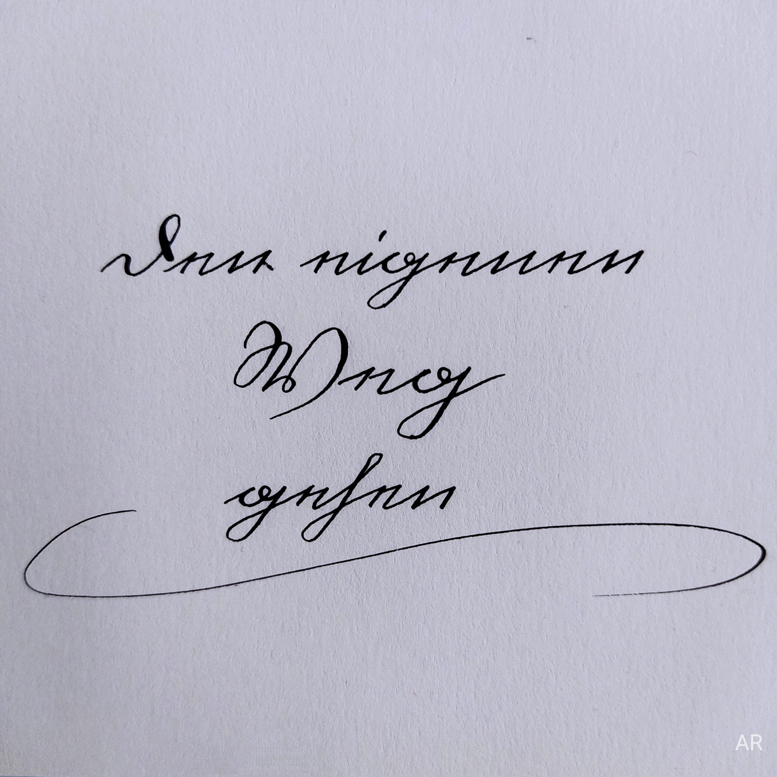
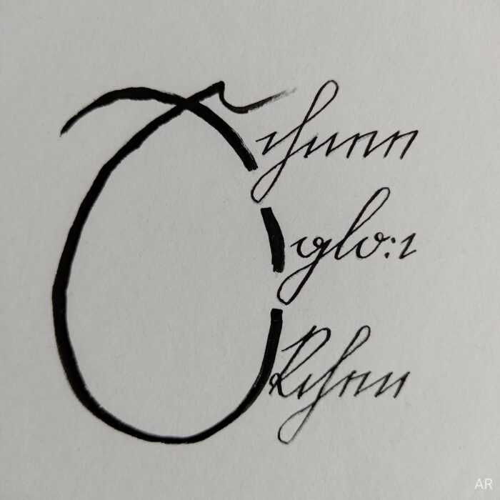
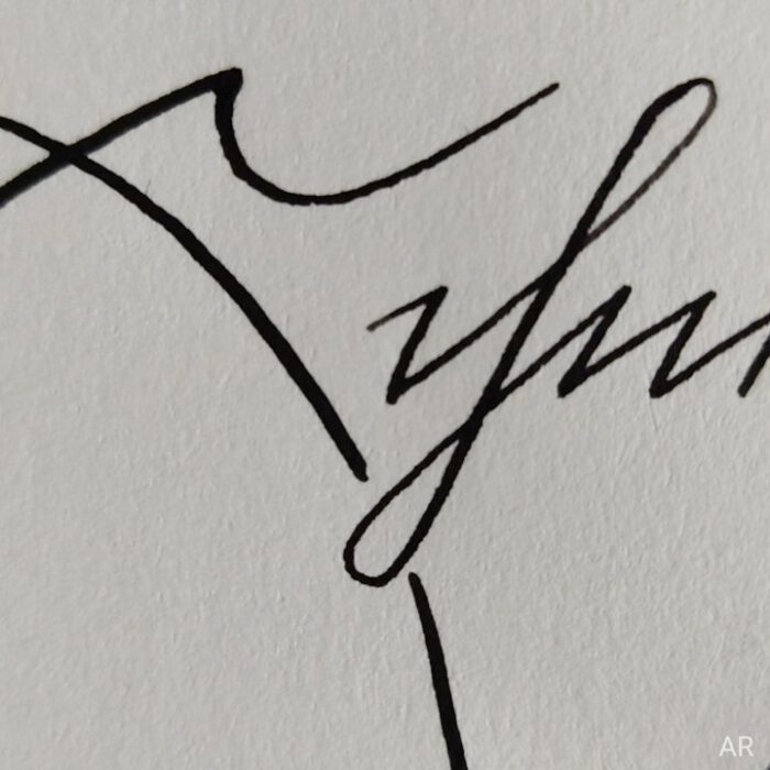
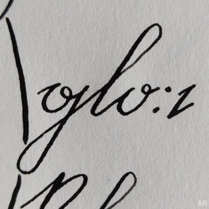
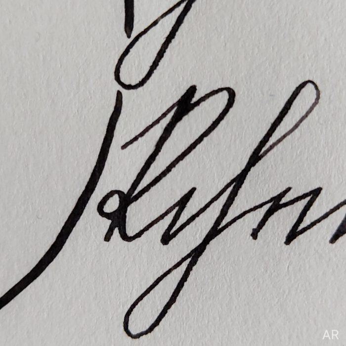
In the end the final lettering is a nice contrast to the rough-looking flower. Delicate but still minimalistic. The letters are written in Kurrent script (aka German cursive) and read “Schneeglöckchen” – “Snowdrop”.
Capital letter on the left: “S”
Top line: “chnee”
Middle line: “glo:c”
Bottom line: “kchen”
The word is splitted to make it fit into a square form.
A historical note: After the Crimean War in the 1850s soldiers took flower bulbs of Galanthus (botanical name of the snowdrop’s genus) to England where they cross-breeded with other forms of snowdrops. That was the starting point of more intense snowdrop breeding in England.1)
Every piece comes with a lesson, it is truly fascinating. At least with this piece I was less in a rush to finish it than usually and could enjoy the process of creating much more. I noticed that I am more confident in creating designs compared to only some months ago.
Also it was gorgeous to sink into the shape of that beautiful snowdrop flower and being surrounded by those spring bloomer vibes.
Have a great day!
Annika

Reference:
1) Seite „Schneeglöckchen“. In: Wikipedia – Die freie Enzyklopädie. Bearbeitungsstand: 24. Februar 2023, 08:44 UTC. URL: https://de.wikipedia.org/w/index.php?title=Schneegl%C3%B6ckchen&oldid=231197415 (Abgerufen: 17. April 2023, 09:11 UTC)
